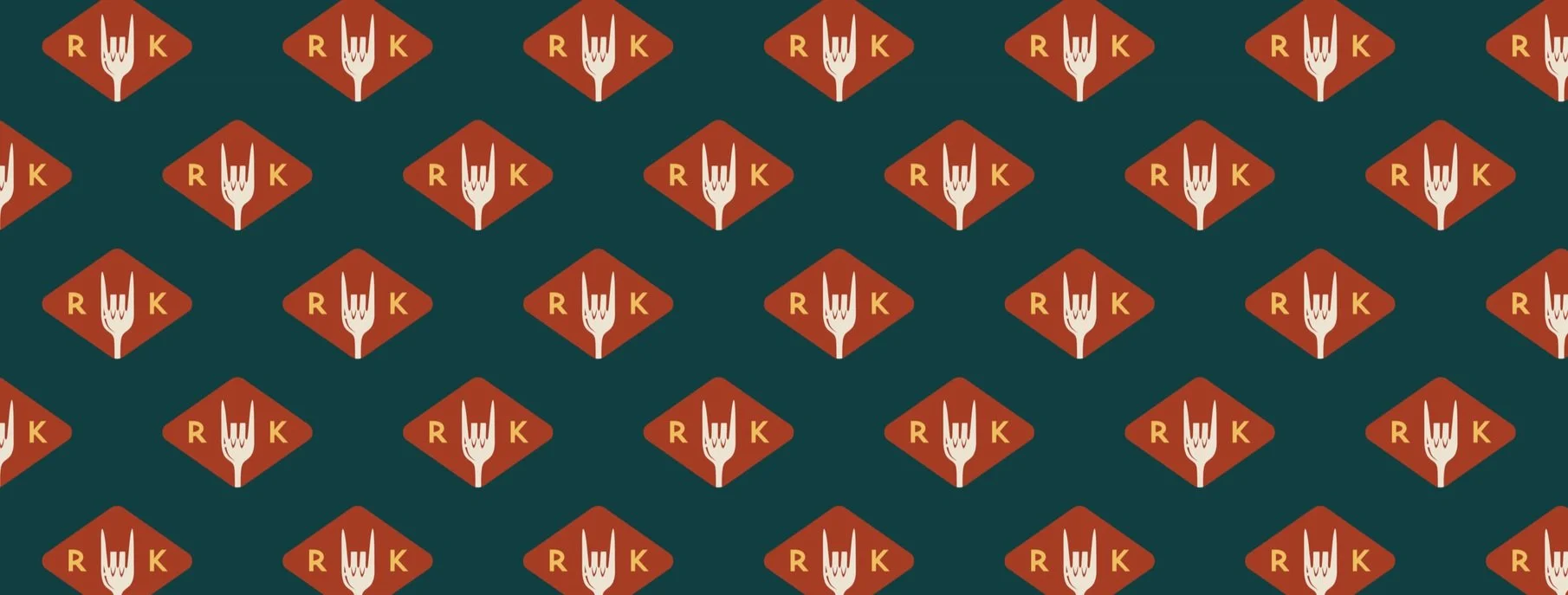
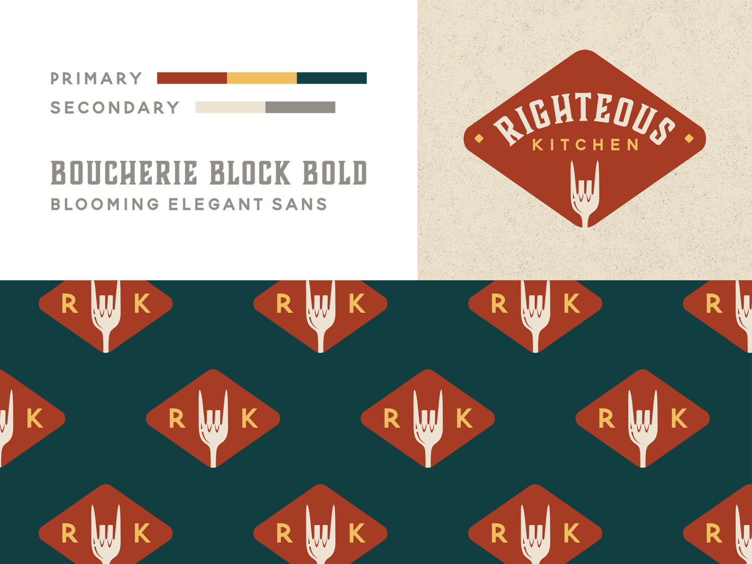
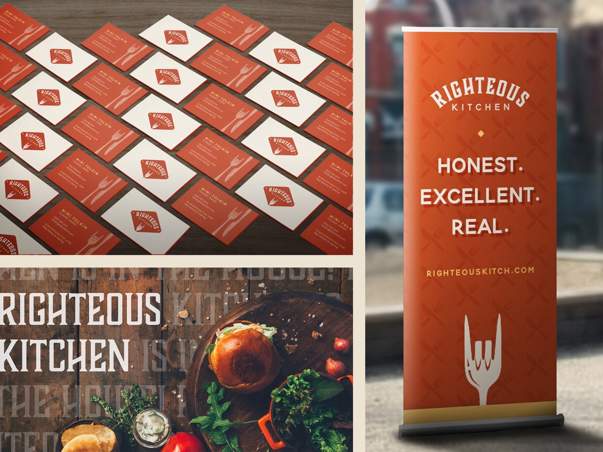
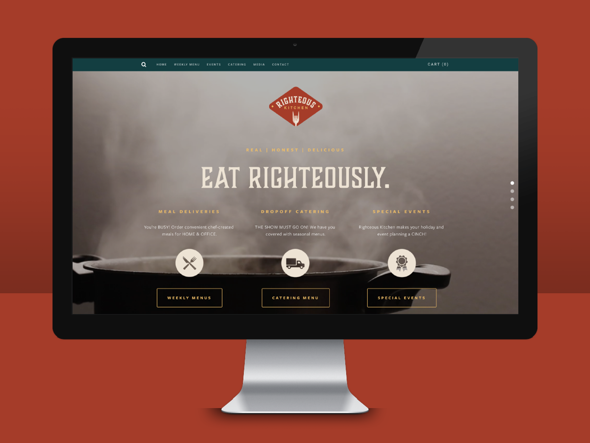
Righteous Kitchen is a Chicago-based startup that offers rockin’, ready-to-eat meals for delivery and pickup.
I developed an identity for Righteous Kitchen that highlighted their core rock n’ roll motif and emphasized their playful, vibrant nature. The brand’s primary visual assets pair bold, bright colors with gritty textures and strong typography.
I developed a logomark for up-and-coming marketing firm Torii Gate to anchor the company’s brand identity.
The logo capitalizes on Torii Gate’s namesake, the torii. In Japanese culture, torii are traditional gates that are often spiritual in nature and symbolize a transition from ordinary to extraordinary. I drew inspiration from these metaphors of passage and change, using them as a foundation for my client’s visual identity. My primary goal was to harmonize these themes with Torii Gate Marketing’s vision, emphasizing their offerings as a potential for innovative transformation.